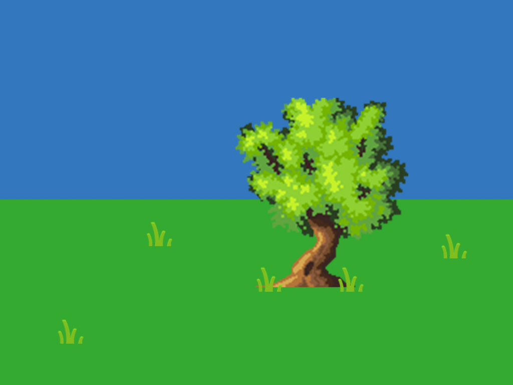
For my game, Nature’s Stand, I have created some concept art of the menus and a basic outline of a level.
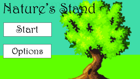
I wanted the title screen for Nature’s Stand to be simplistic so that the player would get to the game faster. I understand that the title screen is the first place the player sees when they load the game, but there isn’t much that I can put on mine due to the lack of features in my game.
The screen contains a grassy background with a single tree on the right side. To the left of that is the title and the interactible buttons. I could improve this menu by adding more details to the background, like grass and clouds, and maybe more interactible elements, although I don’t currently know what they could be.
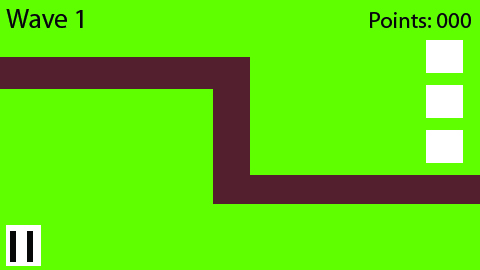
The level design shows what a level would look like along with the UI. The level is a simple dirt path along a grassy plane. The level is quite simple right now as I am more focused on the coding element and aim to improve it if I have the time left. Improvements I could make include adding more detail to both the grass and dirt path. I could also refine the UI by adding more thematic elements, like specific fonts on the text or colors on the boxes.
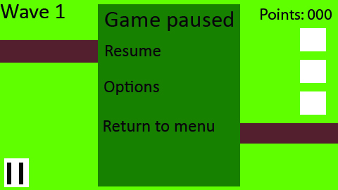
The pause menu concept art is very simple right now. It contains the basic features that the player would need as it isn’t an extremely important aspect right now. I could improve this by adding specific button outlines for each options, as well as a gradient green so it’s a more interesting menu.
0 Comments