This weeks tasks for creative business is to make a 30 second concept for my business idea. One of the required inclusions is an identity or logo for the idea. This post is to document the development of the logo.
My initial idea for the business was a video game development company that focused on creating completely unrealistic games. Looking into why I wanted to develop this idea I found that I loved the idea of escapism, completely escaping from reality into a video game. Following the theme of escapism I found myself thinking more and more about VR, virtual reality, and the games made for it. This helped me develop my idea. My idea is now a video game development company that makes VR games focused completely around escapism.
When trying to come up with a name for the development studio, I found myself looking at the themes I followed when coming up with the idea in the first place. I found myself back with escapism. Escapism games was the first idea I had for the name, though when I googled it the name had already been taken by an existing studio. I wanted to stick with the theme so I shortened it to ESP games. Initially, it was just a shortened version of escapism that would be easy to remember but looking into the term ESP I found it had another meaning. ESP, extrasensory perception, refers to a psychic sense a person may have. I’m not an avid believer in the paranormal so the first thing I linked it to was ghosts and such.
My initial idea for a logo was planet Earth with a VR headset on, in the top right. I drew this before doing any research into what VR headsets actually look like so it just looks like Earth with sunglasses. After looking into various VR headsets, I started to try and draw them on circles. After drawing the last is when I started thinking about the company name, this made me think about trying putting a VR headset on a ghost. I tried various different designs for the ghost but kept the headset the same. I ended up settling with the second design, top right.
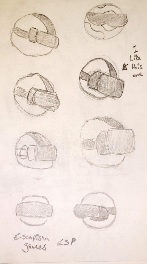
Initial sketches of the logo character 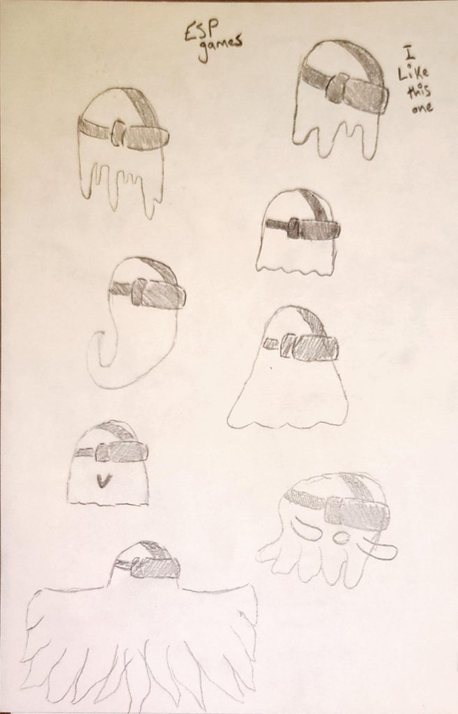
Sketches of the developing logo character
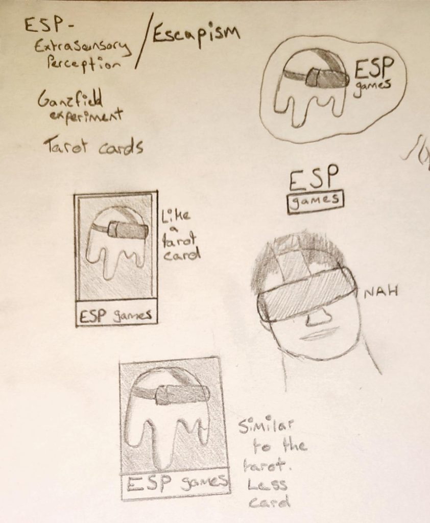
After settling on a design for the character in the logo, I started drawing various different layouts for it. Initially, I just drew the character with the company name next to it and the the name alone. I found that they were quite boring and uninspired. To gather inspiration, I returned to the paranormal theme. I found myself looking at tarot cards and thought it would be quite interesting if I tried drawing the logo out in the layout of one. I want to keep the logo relatively simple so I won’t be drawing one in the style of a tarot card as they’re quite detailed.
After drawing a logo in the style of a tarot card, I drew it again without the border. This makes it look more like a logo and less like a card, although the layout is still inspired. I haven’t yet decided whether I will be using the card-like or card inspired logo, though I have drawn a larger version of the inspired logo as I am currently using that in concepts.
Various sketches of the final logo idea 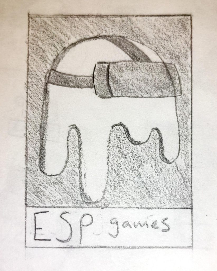
A larger sketch of the logo idea