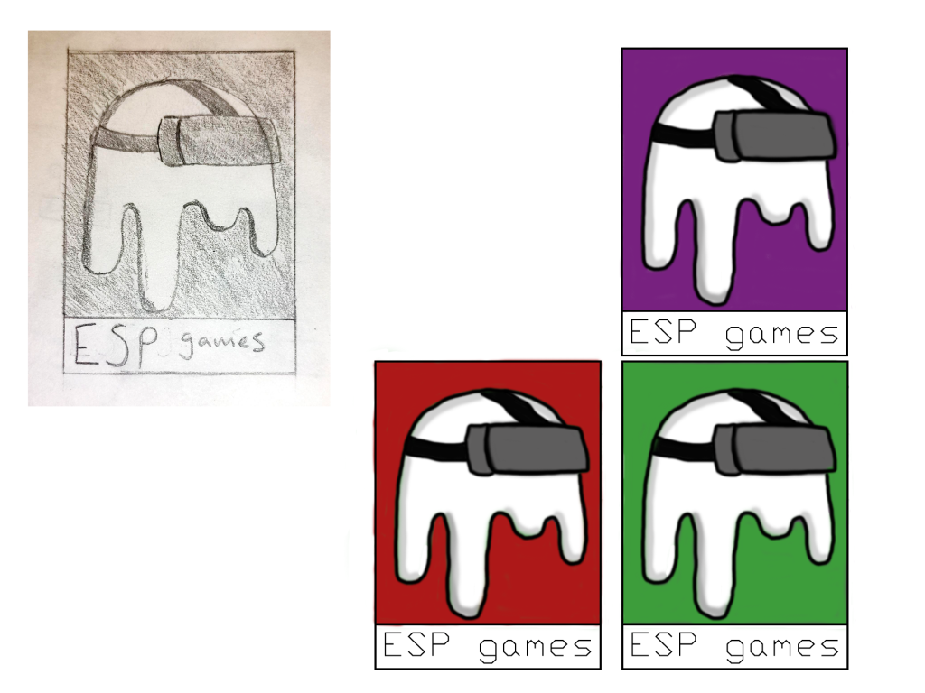
I have further expanded on my initial logo design. I did this by taking the logo into photoshop and recreating it digitally. After recreating it, I added colour to the logo. I traced the outside of the ghost character with black, coloured the inside white coloured the VR headset being worn. After this I added a solid background colour and then tried two other colours.
The colour I initially tried was purple. I find it to be a strange colour as it’s both dark but stands out greatly. The colour gives off the impression of creativity and imagination, traits I would like ESP games to be recognised for.
The second colour I tried was green. Green is a colour often associated with ghost and the slime they are often depicted leaving. This colour is peacful and easy to look at, making it a good colour for the logo as it would be easy on the eyes of viewers.
The third colour I tried was red. I chose a darker shade of red as I found the brighter shades stood out too much, drawing attention away from the character. Red is an exciting and bold colour, it grabs the eyes of viewers so would be a strong colour to use.
I haven’t ultimately decided on which colour I will use for the logo but I also don’t intend on this to be the end of the logo development. I have used a random font for the text on the logo as of now but I intend on using one that has meaning to it and works well with the rest of the logo. I also intend on experimenting with more background variation, maybe a background image or colour gradient.
